You are using an out of date browser. It may not display this or other websites correctly.
You should upgrade or use an alternative browser.
You should upgrade or use an alternative browser.
Awesome Picture!
- Thread starter Tally
- Start date
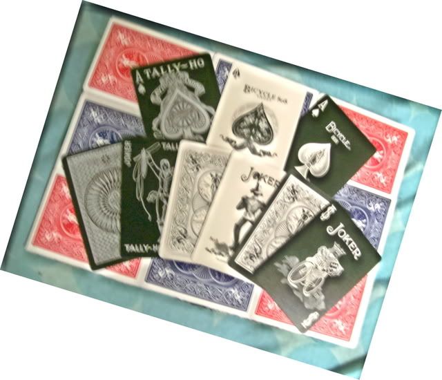
Those are very cool, I like the first one a lot. I like the way you put white and black cards together. Great job.
-RA69
-RA69
Last edited by a moderator:
Those are very cool, I like the first one a lot. I like the way you put white and black cards together. Great job.
-RA69
thanks that's my favorite too.
First one is out of focus and extremely displeasing to look at
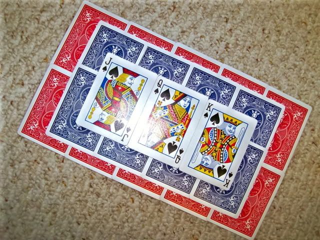
second one has good variety but no real artistic value besides the ordered face cards
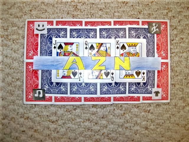
third one is the same as the second except the little paper art, the assuming it's a word "AZN" is centered well but the colors are off, maybe use blue and red like the other cards.
really boring texture in the background gives the pictures a real meek look to them. And the flash that reflected back off the card stock in #2 and #3 shows a considerable amount of inexperience with a camera.
but as an art project this is awesome and shows some fun creativity
~Beans (apparently a hard ass on photography just because he can be)
Nicely done, Tally, I think the light is a bit to bright but we aren't photographers here, we magicians, so keep up the good work bud!
Did you really have to put "AZN" on the cards? I mean I'm proud to be Asian too but I don't see why you guys feel the need to tag "AZN" on EVERY SINGLE THING you do. I mean come on... other than that... good job.. but stop with the AZN dude.. it's a joke


