You are using an out of date browser. It may not display this or other websites correctly.
You should upgrade or use an alternative browser.
You should upgrade or use an alternative browser.
Custom Tally Ho's
- Thread starter tashfiq1993
- Start date
This is depending on the final goal. As I do not want to see the back design on the computer but on a printed card the contrast is extremely important. The other cards would be too dark, even they are nice on the computer screen.
i like beanz's blue i little more because it's more bright and neon-ish. the red on both are a tad meh.
but i'd buy em anyway!
but i'd buy em anyway!
i like beanz's blue i little more because it's more bright and neon-ish. the red on both are a tad meh.
but i'd buy em anyway!
What ever floats your boat.. haha
Calvin Lauber
Last edited by a moderator:
I did not want to start a competition. Just wanted to help and bring new input. Each one can get his favourite custom deck in the end.
Hey i was playing aound in adobe illustrator today, which i suck at, and after 2 hours(lol) came up with this:
http://img408.imageshack.us/my.php?image=treezachcardkb0.png
It's just the bare design, nothing fancy but i think it looks neat. If Daryn or Christian(the experts), want to expand on my design, i would love it!!
the pic is low resolution, i dont know how to upload a better resolution image
~Zach
http://img408.imageshack.us/my.php?image=treezachcardkb0.png
It's just the bare design, nothing fancy but i think it looks neat. If Daryn or Christian(the experts), want to expand on my design, i would love it!!
the pic is low resolution, i dont know how to upload a better resolution image
~Zach
is that an orange tree?? haha.. at least it's original 
Guys, this thread was a custom tally ho thread. I'd like to see everyone's designs.. not just mine in different colors. These 'colored' versions of mine are old news to me, trust me, I've ran so many ways with the ideas, but I'd love to see what everyone else has in their noggin.
Guys, this thread was a custom tally ho thread. I'd like to see everyone's designs.. not just mine in different colors. These 'colored' versions of mine are old news to me, trust me, I've ran so many ways with the ideas, but I'd love to see what everyone else has in their noggin.
whats wrong with an orange tree?
i didn't say anything was wrong with it.. it was totally not what I expected to see. I thought it was original at least! Keep 'em comin!
whats wrong with an orange tree?
The fact that it's an orange tree... haha just kidding.
Yeah let's see some more ideas!
It would be much better to have one thread that everyone puts their ideas in,
instead of cluttering up the forums with a million "cards i made up" threads.
I have two decks I'm in the middle of making, I'll put up pics later.
Calvin Lauber
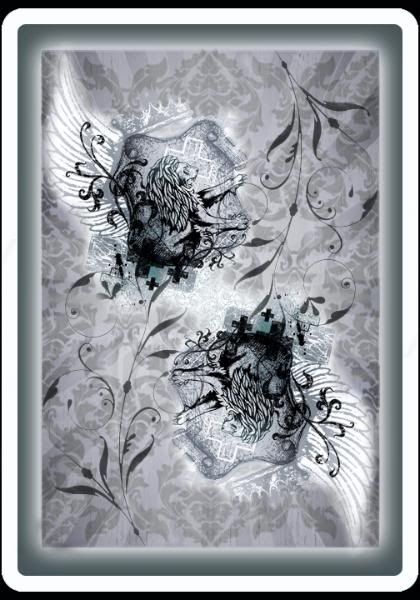
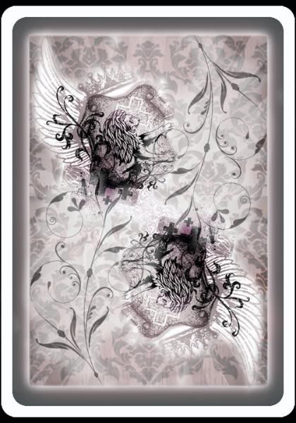
There we go, It's just a rough draft, but it's an idea I've been messing with.
What cha' think?
EDIT: New version below
What cha' think?
EDIT: New version below
Last edited by a moderator:
Calvin, thats AWESOME! I love the urban stylish design.Or how about this one? I refined it little more.

Calvin, thats AWESOME! I love the urban stylish design.
Thanks man!
If i get a little more feed back this will be the design I go with for printing
a few of these decks.
Calvin Lauber
Great work. Just keep in mind that there should be a white border around the edges.
And perhaps you should (also with the other cards, I corrected it when I printed them) choose smaller corner roundings as this would not look good if printed onto Bicycle style cards. One just expect smaller ones and the larger do not look good on them. I do not know the exact measurement of the corner diameters of Bikes etc. in inch, I think it must be 1/8 inch, but it is 3.175 mm. Just put that in your design program for the canvas of the cards and you will see what I mean.
BTW: it is a oneway deck again if you look at the light background in the middle top and bottom part of the back. Intended?
I thought this was a custom Tally Ho thread.....?
Well... yeah but I didn't want to start a new thread.
It would be better if there was one thread where people could
post all of their card ideas, so there isn't like 1,000 threads.. haha.
Calvin Lauber
Great work. Just keep in mind that there should be a white border around the edges.
And perhaps you should (also with the other cards, I corrected it when I printed them) choose smaller corner roundings as this would not look good if printed onto Bicycle style cards. One just expect smaller ones and the larger do not look good on them. I do not know the exact measurement of the corner diameters of Bikes etc. in inch, I think it must be 1/8 inch, but it is 3.175 mm. Just put that in your design program for the canvas of the cards and you will see what I mean.
BTW: it is a oneway deck again if you look at the light background in the middle top and bottom part of the back. Intended?
O thanks!
.. Yeah I didn't see that, thanks for pointing that out, I'll have to fix it.
Calvin Lauber
Last edited by a moderator:
Final Copy. It's no longer a one way back, I cleaned some of it up, and made the edges less round.


