Dec 31, 2020
20
15
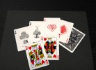
Hi there, almost two months since the last update, but here is something new!

- Reworked Ace of Spades with the same artist who already reworked the Ace of Clubs
- Reworked Ace of Hearts
- Investigation for custom font (not sure about it yet though...)
...and, where I am mostly interested by your thoughts: here is a sample of the King of Hearts in French (or "Parisian") pattern.
As the aces and jokers got more and more into this old style, I was wondering whether the English pattern was still fitting.
And after all, Robert-Houdin being French, it would fit not only style wise but also context wise. I was also thinking it would make the deck more unique, but we would lose the subtle change of classic English style.

Also, if we use French language in general for the deck, what do you think about using French for the court cards too? ("R" from "Roi" for the King, "D" from "Dame" for the Queen; and "V" from "Valet" for the Jack.

Really curious to hear your thoughts on that!
 

Attachments

  • Robert-Houdin_close-up_Aces.5.jpg
    Robert-Houdin_close-up_Aces.5.jpg
    1,017.1 KB · Views: 144
Oct 4, 2022
79
22
First, the ace of spades is definitely much better now; the prior handkerchief didn’t look like one, and the hand was really needed. The cloth itself, with the folds, is more cloth-like and also both the hand and cloth are subtly less bold than the rabbit and hat so that the latter themes jump out adequately. Very nice. On the ace of hearts, whereas I had given a rough mock-up of two hands fanning the cards, your current retention of just one on the right is far better. The hand on the left picking a card adds much needed interest to that, and makes the action of the magic trick salient, which just fanning the cards lacked. The shading to complete the form behind the hands is perfect. Just enough to fill out the shape, yet faint enough as to let the rest of the image, the theme itself, pop out and receive the focus.

I like the distinctiveness of the font for the A that you show on the, er, trèfle and pique—since we’re shifting to more and more French, and also quite like the newer roi. Any change from the current mainstream court cards would be a plus IMO. A jump to a more Parisian pattern, something which departs at least a bit from the current Bicycle 808 faces, or even goes all the way back to real mid-19th-century designs or new ones inspired by them would be interesting. Anything from subtle shifts to drastic departure. Which brings to mind the question: what cards would Robert-Houdin have actually used? I’d love to see what results research into that comes up with, and any ideas you get from that. Did the French decks ever have kings with swords, gold coins, war clubs etc., the way the Spanish-Italian ones do? I wonder how hetereogeneous the designs in France were during his lifetime, and what historical resources there are for researching this.

Given how unique a deck it is, and the fact that it’s really going to *specifically* appeal to his admirers and magic history buffs, R D and V with actual French and not modern classic English style court cards would all be a plus, at least for me. I don’t think that this target audience would be put off by having indices not say A K Q J. Were some French cards marked 1 for the ace back then, too?
 
Dec 31, 2020
20
15
Another month since the last update, but there was so much happening!
First of all, I'm so happy to announce that I'll work together with Biz, who created "The Magicians playing cards", confirming that the Robert-Houdin playing cards will at least reach the state of the Kickstarter campaign, and hopefully increase its chances to be a successful one.
Erik-photos-collage_4472x.jpg

The partnership is not only fruitful thanks to his experience in the field, but is already benefiting the project with several ideas, among which one that I'm so excited about: the back cards animation.
Indeed, when put in correct order, one could shuffle the cards like a flipbook, and discover that many elements (gears, dot stars, clock, butterfly, but most importantly the orange tree itself) are brought to life thanks to this animation. Similarly to the aces being almost an optical illusion, the animation is conjured from the movement of the cards.
Another extremely exciting aspect is that we found a solution for the marking of the cards, in a very subtle way yet very easy to read, and -cherry on the top-, that is not even flashing during this flipbook animation. I'll introduce it later when it is more refined.
In the meantime, here is the preview, created from another software (Blender) than the one I used so far (Keyshot), giving more control and possibilities.

 
  • Like
Reactions: Dragonbones
Dec 31, 2020
20
15
As always, thank you Dragonbones for the feedback. We've decided to follow most of what we described: the French pattern, and french language even for the cards. To answer your question, looking at the dates, it seems highly likely that Robert-Houdin was actually using the French pattern, since it was created a few decades before he was born, and updated to the symmetric version during his life. And that makes the idea of using this style even more attractive :)
More info here: https://www.wopc.co.uk/france/paris
 
  • Like
Reactions: Dragonbones
Oct 4, 2022
79
22
Awesome! The gears, the butterfly, the background around the tree... One starts to get the impression that Robert-Houdin himself would have liked these cards.
 
  • Like
Reactions: Nyrow
Dec 31, 2020
20
15
@arthurR980
The project is still running, although slower than expected.
Here are some news:
2023-09-22_02h01_08.png


The front of the tuck box was a big challenge for me ...and I think I said that for every single artwork of the project ><
If you go a few pages before in this thread, you'll find the old front illustration with a magician hat sitting on "Robert-Houdin" name, and shaping an ace of Clubs.
I had a hard time to give up this direction, not only because there had been quite some effort into it, but because it was close to work (for me). Yet, I got feedback from other card designers that this was the main area to improve in the overall deck, and I also had the issue with the engraving style of the hat which would not have been technically feasible (with white foil). So I started almost from scratch, and took the opportunity to rename the deck "l'Oranger merveilleux".
My main inspiration, apart from the obvious tree, was an original poster for one of the magician's shows. And while the vintage style would have been very original for a tuck box, I wanted to achieve something more refined and elegant. But apart from the style, the idea of showing the actual theater in which Robert-Houdin performed (and which lasted more than 50 years), made sense to me to give more context to the trick. That way, I could introduce Robert-Houdin's name (at the top, embossed), in a quite subtle way, to keep the focus on the deck's actual name. And the few architectural elements (like the columns, balconies, chandeliers) would immerse the owner or spectator of the deck a bit more in his era.
What I particularly like with this approach is that it gives context to this trick and thus explains a bit more the back of the cards. For example the front highlights the oranges in gold, but also the butterflies that lift the ring, which are already on the back of the cards but in a quite abstract representation. Same idea for the table. I like the curves and aesthetics that the legs of the table bring to the back of the cards but it's a bit hard to understand them as such because of the symmetry.

Because the card suppliers are limited to a specific amount of cards that can be printed on a printing board and that can fit in a standard deck, I would have been very limited (the two jokers and maybe one other card max). So instead we will probably give an additional small package of bonus cards as a separate add-on, including:
- the "poster" card
- Robert-Houdin's portait with a quote
- Instructions for the order of the cards to create the back animation
- And trick oriented cards

As always, I share the whole development with you to get feedback and improve the project, so please suggest anything :)
 
Searching...
{[{ searchResultsCount }]} Results